Medicine Blues?
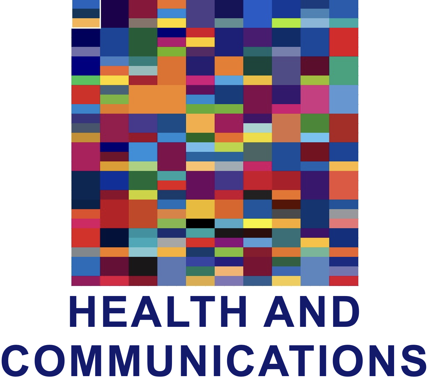
This story begins with a theory: the colors of logos/branding for prescription medicines are predominantly blue. The thought was that most medicines are ameliorating a condition or providing relief (easing pain, reducing cholesterol, etc.), all of them essentially soothing, diminishing, in effect 'cooling'. So it would make sense for evocative branding to be blue.
To test this, I took a list of the Top 100 Most Prescribed, Top Selling Drugs and sampled all of the logo colors. The result was the matrix above. The upper left-hand block (with the white border) is Abilify, the dark blue to the right of that is Nexium, the maroon and gray to the right of that is Humira, etc. With combined sales of $163.8 billion, there must have been some serious research to select the most effective branding and the most appropriate use of color. So, mostly blue? Looks like it, but hard to tell. So roughly grouping the same color blocks chromatically produced this:
... and while blue (and purple) predominate they don't overwhelm. So, not surprisingly, the branding strategies for each of these 100 medicines appears to be more complex than simply associating the color blue with relief.
Post script: Looking down the list of the medicines, from highest to lowest sales, I was surprised that I only got to number seven (Remicade) before hitting a drug I'd never heard of, even though it was responsible for more than four and a quarter billion dollars in sales. How far did you get?


