The Landscape of Health Communications
It’s been a little over two and a half years since starting Health and Communications (appropriately enough, in a doctor’s waiting room), writing on everything from Target’s pill bottles to the health credentials of candidates to become Secretary General of the UN. But in that time I’ve yet to find a graphic that shows the full scope –the breadth and detail– of health communications.
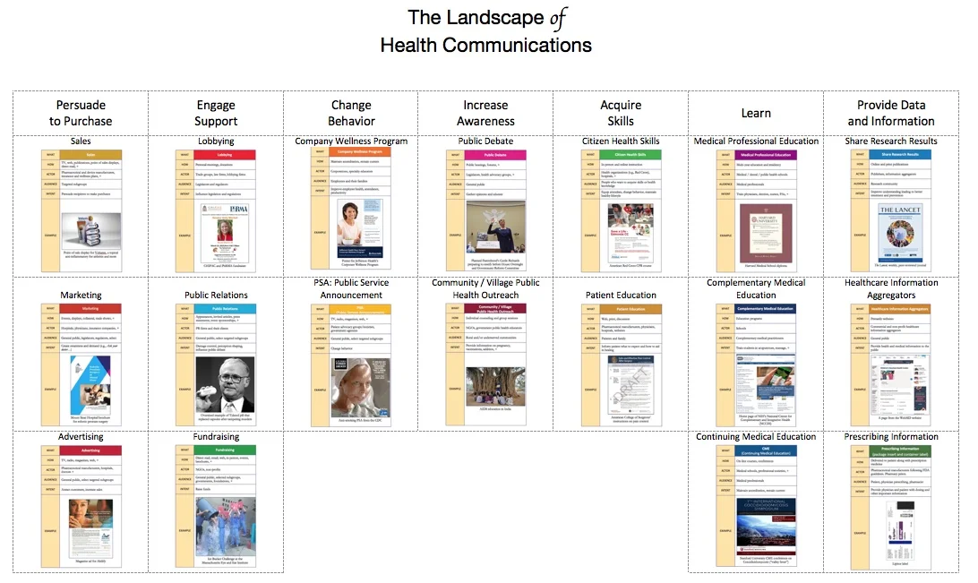
So for this entry, I wanted to create a large (2' x 3') graphic of the entire landscape of health communications and make these wall or classroom posters available to whoever might want one. It would have looked something like this:
Two problems: (1) the website won’t support eps files, so readers couldn’t zoom in and out without loss of detail or clarity, and (2) even if a few hundred readers wanted an actual poster, I couldn’t find a way to reproduce and send them for less than about $30 a piece, which seemed way too expensive.
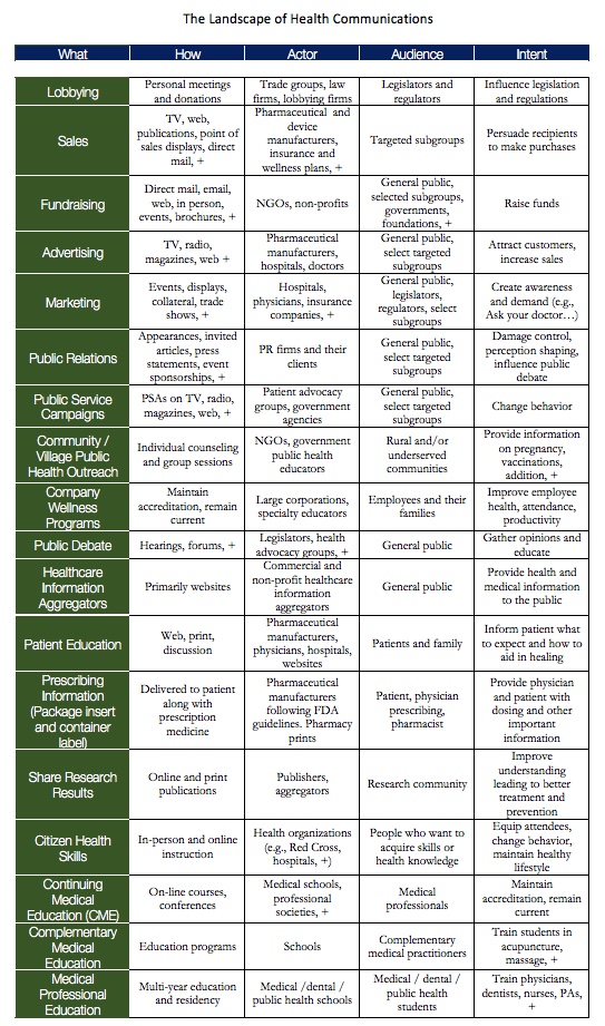
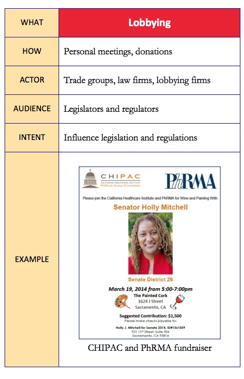
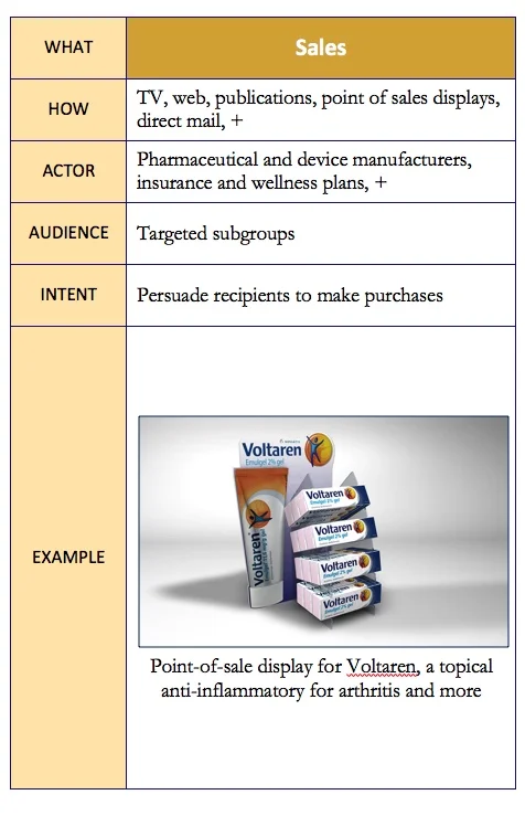
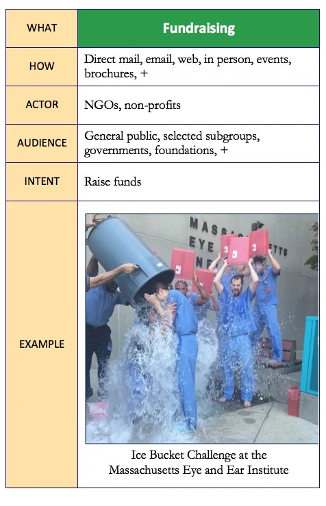
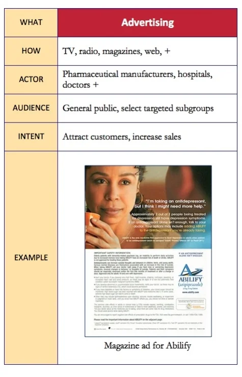
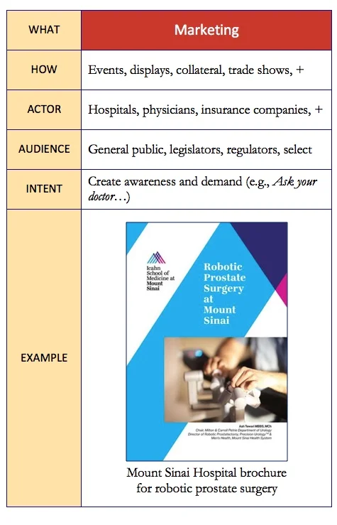
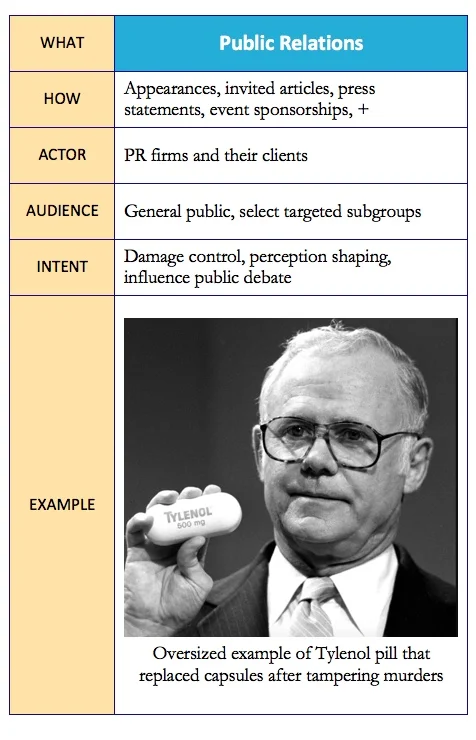
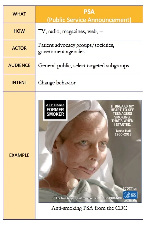
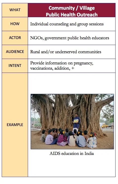
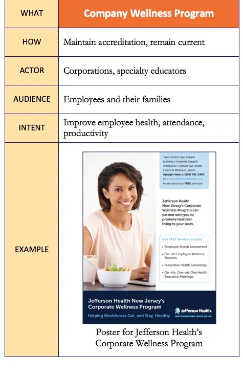
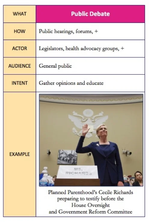
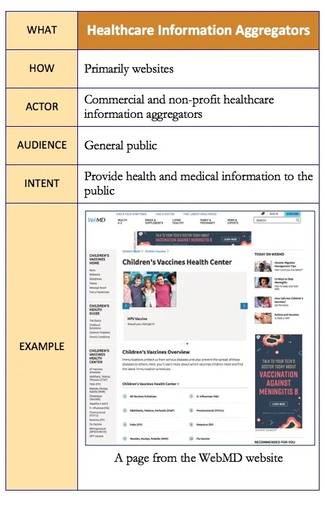
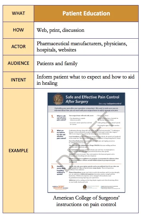
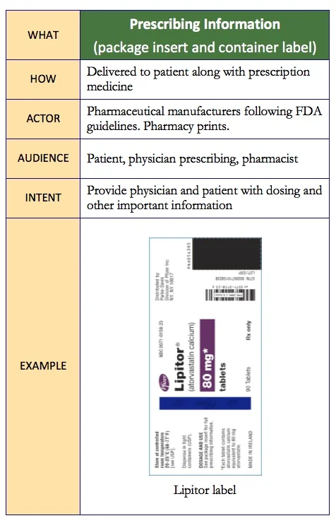
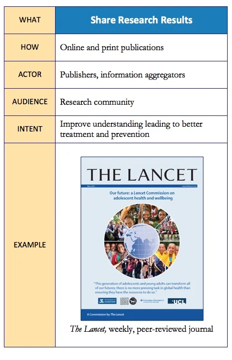
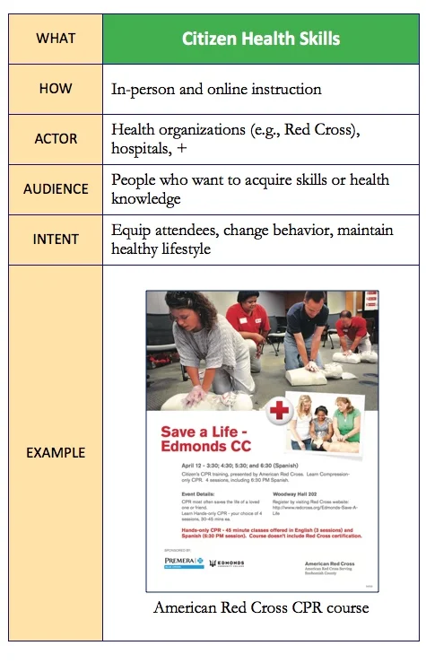
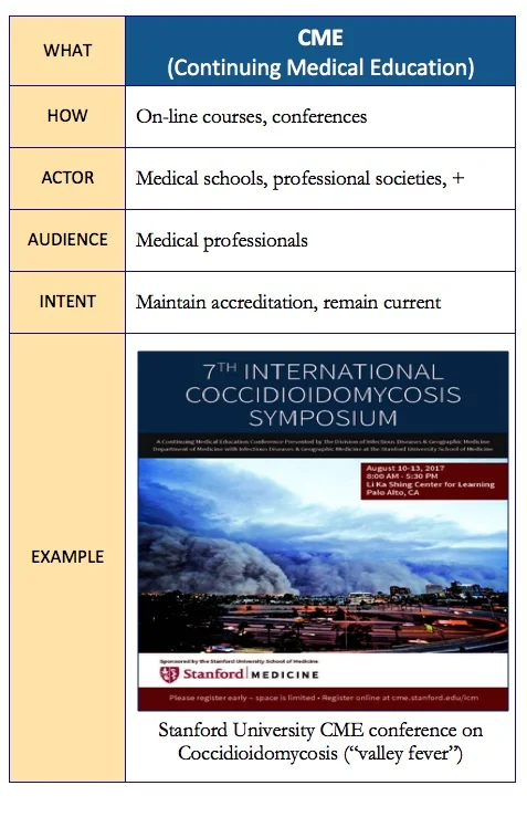
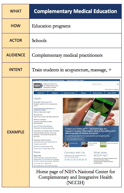
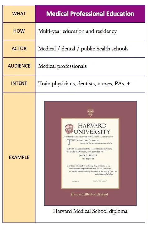
Instead, I’ve created a pretty dense table of the what, how, who, etc. of health communications, followed by the individual tiles or cards that would have appeared in the poster. (The cards also contain examples.) In the poster image above and in both the table and the cards below, the various communications methods are arranged in a spectrum that ranges from persuasion to education.
Clearly this is not an exhaustive list, if only because technology is constantly giving rise to new ways to communicate in health-related fields and elsewhere. (Take, for example, the recent use of geofencing around hospitals.) And there are layers of detail that would have overwhelmed any presentation. For instance, there are companies that make corporate wellness programs for other companies, and there are companies that make the communications materials for the companies that make the corporate wellness programs for other companies…and so on. So there could certainly be more methods and every cell in the table and within the cards could end in + or etc. Instead, this is a generalized sketch of the field with just enough detail to show what a rich and complex landscape health communications inhabit.
Why is this useful? It may of course encourage younger readers to pursue careers in health communications by showing them options they had not previously considered. For others, the cards can be sorted to lay out the elements of a comprehensive communications campaign, and may be helpful in showing clients how such a campaign would integrate and reinforce their messaging. In fact, as examples, many of the cards could be used to plan other communications projects, not just ones relating to health. And if I've missed your particular area of health communications, my apologies; I guess that just shows how complex this field really is.
Note that the cards are jpg images, so while they can’t be edited, they can be copied, saved, printed, or otherwise reused, which I strongly encourage you to do.
Logos, images, and other copyrighted materials used in this entry are covered by the Fair Use Act, 17 U.S.C. 107: Limitations on Exclusive Rights: Fair Use.
