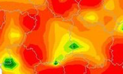
Mapping Flu
Maps that combine geographic and epidemiological information can be highly effective ways to communicate with the public. [ 1 ] A case in point is presenting results from surveillance reports on seasonal influenza.
Here in the US, the CDC issues weekly reports on, among other information, the level of influenza activity and its geographic spread. However by separating these two factors and presenting them in different maps, the result is probably more confusing to the public than it need be.
For example, under the heading “Weekly US Map: Influenza Summary Update,” [ 2 ] (Map-1, below) both California and Iowa (indicated by the red arrows for those less familiar with the US) are shown to have “Widespread” flu.
As the asterisked footnote makes clear, this map deals only with geographic spread, meaning that, for these two states as least, flu could be found throughout the state; i.e., everywhere. And if that’s all you saw –and that’s all that’s on that page of the website– you’d be forgiven for thinking that maybe now is not the best time to vacation in either of these two states.
On the other hand, if you had navigated to another section of the CDC’s website, under the title FluView [ 3 ], you’d find not only Map-1 but also Map-2, indicating the level of flu activity.
And here on Map-2 it’s clear that on the CDC’s scale, California and Iowa actually have the lowest incidence of flu… so maybe now the vacation’s back on.
Map-1 Weekly US Map: Influenza Summary Update [ CDC ]
Map-2 FluView [ CDC ]
There should be a way to combine the information from both of these maps into one representation. For instance, a 3D, bird’s-eye view could show geographic spread by color (as in Map-1) but show activity as raised state-shaped bars, rising higher in proportion to the prevalence of the flu.
Absent a one-map solution, perhaps the CDC could:
Use the same outline for both maps. For example, Map-1 shows Guam and the US Virgin Islands, Map-2 does not, though Map-2 shows New York City while Map-1 does not. Alaska and Puerto Rico are differently shaped and proportioned between the two maps, etc.
Run the scales in the same direction. Map-1’s scale runs least-to-worst, top-to-bottom, while Map-2’s scale runs in the opposite direction, worst-to-least, top-to-bottom.
Use a similar color scheme and texturing for both scales.
Position the two maps so one follows the other, as I’ve done here, for easy comparison. In FluView, the maps are separated by two paragraphs of text (about 300 words) so on most computers it’s not possible to view both maps at the same time. In the Weekly Summary Update, only one map is shown.
By now you may have noticed something else odd about these maps; flu appears to change its intensity or geographic spread abruptly at state borders.
A few countries use interpolation to create maps that show a more realistic and fluid distribution of flu-like symptoms. Here, for example, is one from France [ 4 ]:
Map-3 Syndromes grippaux [ French Ministry of Health and Sport ]
To get an idea of the level of detail this map shows, remember that France is only slightly smaller than Texas (which the CDC’s maps show at a single level of geographic spread and intensity). Notice, too, that the French map also displays data for the previous four weeks, giving the viewer a sense of how the disease is trending. [ 5 ]
Two Questions
Could the CDC produce similar, interpolated maps? Unfortunately, probably not. The reason is that each state reports flu symptom data differently; e.g., for Map-2, Texas reports by county, Illinois by city, and Utah by what appear to be SMSAs (Standard Metropolitan Statistical Areas). [ 6 ] To produce FluView and FluView Interactive, the CDC employs five different categories of data, which are not uniformly reported across the states. [ 7 ]
Could the US government require all states to report their data in a uniform manner? Again, unfortunately, probably not. A CDC report sums up the situation succinctly:
Reporting of cases of communicable disease is important in the planning and evaluation of disease prevention and control programs, in the assurance of appropriate medical therapy, and in the detection of common-source outbreaks. In the United States, the authority to require notification of cases of disease resides in the respective state legislatures. (emphasis added) [ 8 ]
And as the report also makes clear, these localities don't even necessarily all use the same definitions of the diseases on which they are reporting.
It’s regrettable that the data collection is not more uniform because it stands in the way of clearer health communications, which are, after all, the basis for making important decisions about matters far weightier than simply where to vacation.
Notes
[ 1 ] Princeton’s library has a interesting page of such maps from the 18th and 19th Centuries, including, of course, John Snow’s London cholera map: http://libweb5.princeton.edu/visual_materials/maps/websites/thematic-maps/quantitative/medicine/medicine.html
[ 2 ] http://www.cdc.gov/flu/weekly/usmap.htm
[ 3 ] http://www.cdc.gov/flu/weekly/
[ 4 ] http://www.slideshare.net/jmicaux/swhebdo-fr-201108
[ 5 ] "At the heart of quantitative reasoning is a single question: Compared to what?" See Edward Tufte, Envisioning Information, page 67. See all of Tufte's books for thoughtful and reasoned guidelines on how to present information with clarity and integrity: http://www.edwardtufte.com/tufte/books_vdqi .
[ 6 ] http://gis.cdc.gov/grasp/fluview/main.html


![Map-1 Weekly US Map: Influenza Summary Update [ CDC ]](https://images.squarespace-cdn.com/content/v1/544e6c33e4b0b7c1dfc1b579/1459129258024-BBQPIRDU7I7SWQGRPYX1/image-asset.jpeg)
![Map-2 FluView [ CDC ]](https://images.squarespace-cdn.com/content/v1/544e6c33e4b0b7c1dfc1b579/1459129337803-CJPJ11TA5UDIHGC229DV/image-asset.jpeg)
![Map-3 Syndromes grippaux [ French Ministry of Health and Sport ]](https://images.squarespace-cdn.com/content/v1/544e6c33e4b0b7c1dfc1b579/1459129545640-M3PKTAUBBXH4C93MJ8CR/image-asset.jpeg)