Why CVS Should Retain Target’s ClearRx System
See 11.17.16 update here.
Ten years ago Target introduced the first significant –and useful– improvement to the traditional, amber-colored, plastic pill container in decades. Called ClearRx, it was a triumph of thoughtful and clever design, serving real human needs. The system’s advantages were many:
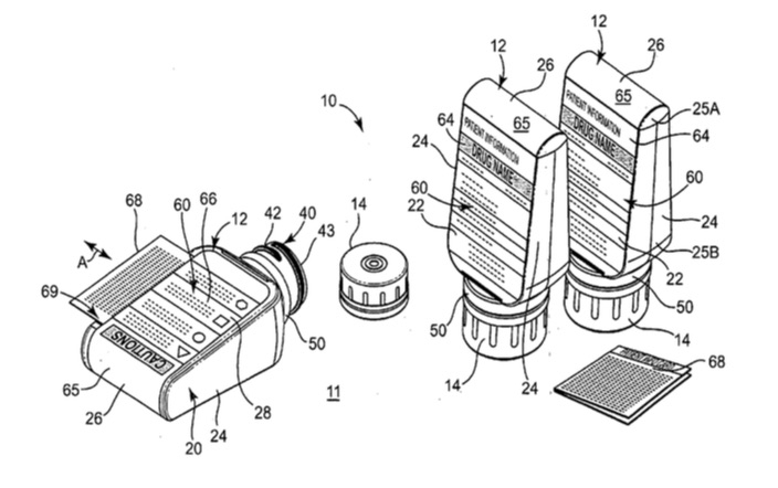
The bottle’s tent-like shape provided two flat spaces for labels, eliminating the back-and-forth turning required to read a label affixed to a cylinder
That shape, in conjunction with a larger, inverted cap, made the container far easier to open for those with arthritis and similar muscular diminishment
The colored rings clearly distinguished prescriptions meant for different family members
…and more.
Last month it was announced that CVS was buying Target’s pharmacy business. Checking with Target about ClearRx, I was told:
“Target will transfer to CVS Health all of our operating healthcare assets, including inventory, equipment, and the intellectual property for our ClearRx bottle design.” [ 1 ]
And while pill bottle design might seem like a minor concern compared to a $1.9 billion transaction, I hope CVS does give it serious consideration. Continued use of ClearRx at Target’s 1,500+ pharmacies would certainly be a smart move to keep faith with Target’s current customers. Introducing it to CVS’s own pharmacies, which number over 7,800, would provide a new story line to reintroduce and emphasize CVS’s commitment to health care. But the real PR win, and clever business strategy, would be to make the ClearRx patents available to anyone. It would cast CVS in a magnanimous light and thereafter every time someone picked up a ClearRx prescription at a Walgreens or Rite Aid or even a Walmart, it might subliminally remind them of CVS. It might also be seen as a mitigating factor by any regulators that had qualms about the purchase.
Illustration from the original ClearRx patent, US2006163110 (A1), from designers Deborah Adler and Klaus Rosberg.
But the most important reason for using ClearRx is safety. It’s hard to find reliable statistics on some fairly precise questions, like How many people (at home) mistakenly take the wrong dose of their medicine? Or How often (again, at home) is prescription medicine mistakenly taken by the wrong family member? [ 2 ] But it stands to reason that the clearer the labeling (in terms of layout and information placement, type size, icons, and prominence of patient identification and pharmaceutical name) the fewer the accidents. And it’s easy to see that ClearRx is a significant improvement in each of these areas.
So for all of these reasons, and as a brilliant example of how better communication can contribute to better health, I hope CVS retains ClearRx and greatly expands its use.
Extra for Designers
Would it surprise you to learn the Target and CVS logos use precisely the same shade of red? Both companies specify PMS 186 in style instructions. But to my mind Target’s red has always seemed more cherry- or blue-red while CVS’s has always seemed a more softer, orange-red.
Maybe it’s the in-store experience; CVS’s walls look to be a creamy-white and Target’s a more brighter white, each setting off their logos slightly differently. Or maybe Target’s bulls eye circles create something like a Josef Albers halo effect, making the circles appear to reflect each other or shimmer. [ 3 ] Or possibly Target's rings create a foreground / background effect that pushes the rings forward, making them more prominent and appearing to be more intensely red.
Notes
On ClearRx, see Target’s description: http://www.target.com/c/clearrx-pharmacy-health/-/N-4ynq0
On the two ClearRx designers, see:
Klaus Rosburg’s website: http://www.sonicny.com/Packaging_9_1.html
Deborah Adler’s website, http://www.adlerdesign.com and her TEDx RVA talk https://www.youtube.com/watch?v=A_DGAGzyPEg
[ 1 ] e-Mail from Target. No response from inquires to CVS.
[ 2 ] In 2006 the Institute of Medicine estimated that there were at least 1.5 million annual, preventable Adverse Drug Effects (ADEs) in hospitals, long-term care facilities, and for out-patient Medicare recipients. This figure however includes mis-prescribed dosages and does not include mistaken dosing that did not lead to an ADE. Still, this figure hints at the magnitude of the problem which has likely grown as average age of the US population has continued to grow over the past nine years. See http://iom.nationalacademies.org/~/media/Files/Report%20Files/2006/Preventing-Medication-Errors-Quality-Chasm-Series/medicationerrorsnew.pdf
[ 3 ] In 1972, Chris Fahlman, a friend, artist, and entertainment entrepreneur, clearly demonstrated that the so-called Albers Effect can occur just as markedly in concentric, superimposed circles as it had for Albers using squares. See https://www.linkedin.com/pub/chris-fahlman/b/254/b91


