What Can a Salvador Dali Painting Tell Us About Health Communications?
At the National Gallery of Art in Washington, DC, there is a remarkable painting, titled The Sacrament of the Last Supper, by Salvador Dali. It hangs, oddly but perhaps quite intentionally, not in one of the galleries but in a niche off the main hallway. The painting is large, nearly ten feet wide (framed), and set back from where any viewer would initially encounter it. At first, it appears to be the fairly familiar theme of Christ and his apostles arrayed around a table for the last supper. No Dali-esque dripping clocks or burning giraffes, but somewhat incongruously there also appears to be some disconnected ceiling beams and part of a torso floating above the scene below. [1]
Photo credit and image rights: Courtesy National Gallery of Art, Washington. © Salvador Dalí, Gala-Salvador Dalí Foundation / Artists Rights Society (ARS), New York / Erich Lessing / Art Resource, NY.
But as viewers step closer they’re likely to experience a series of visual revelations as well as a progression of emotional responses. With each step closer, the apostles become more opaque and eventually almost disappear altogether from the viewer’s field of view, probably as a function both of the size of the painting and the tonal similarities of their robes to that of the table. Emotionally, the viewer has transitioned from the familiar to the personal. Stepping closer still, it becomes evident that there is only one glass of wine and one (broken) loaf of bread on the table, and both are placed directly in front of you. So now the feeling turns to a sense that you have a place here and have been invited into this scene, to participate in this rite. The emotional response has progressed from personal to a sensation that you are now somehow special.
Approaching yet closer, your visual focus is on Christ sitting (or floating) directly before you and you lose sight of the beams and the outstretched arms above. And yet, you will still be somehow aware of those arms and you will feel embraced.
I said earlier that Dali’s painting may have been hung in an unusual space for a reason. I think the curators wanted viewers to start from a distance, slowly moving forward and going through that layered response, a series of visual surprises and associated emotions. In just a few steps, viewers travel emotionally from familiar to personal to participatory to embraced. [2]
But what does this have to do with health and communications?
Just this: There are any number of communications techniques (e.g., relating a hopeful story, creating and then relieving anxiety, etc.) any one of which could usefully be employed in health-related communications. And this technique –scaffolding or layering of information and emotional responses– is a particularly effective one.
Here is a very simple example. Passing this car and seeing that a small teddy bear is presumably driving evokes a smile and amusement.
But a closer look reveals that the bear is wearing a surgical mask, and that in turn surfaces a more sober reminder that COVID is still present and highly communicable.
For a more complex example, look no further than commercials for medicines prescribed for everything from plaque psoriasis to diabetes to AIDS. There, often in only 30 seconds or a minute, the successive, layered messages are:
1. Take control (by taking the medication)
2. Don’t be ashamed of your condition
3. Don’t be limited in what you do or your enjoyment of it
4. You will (perhaps again?) be welcomed by your friends / family / community
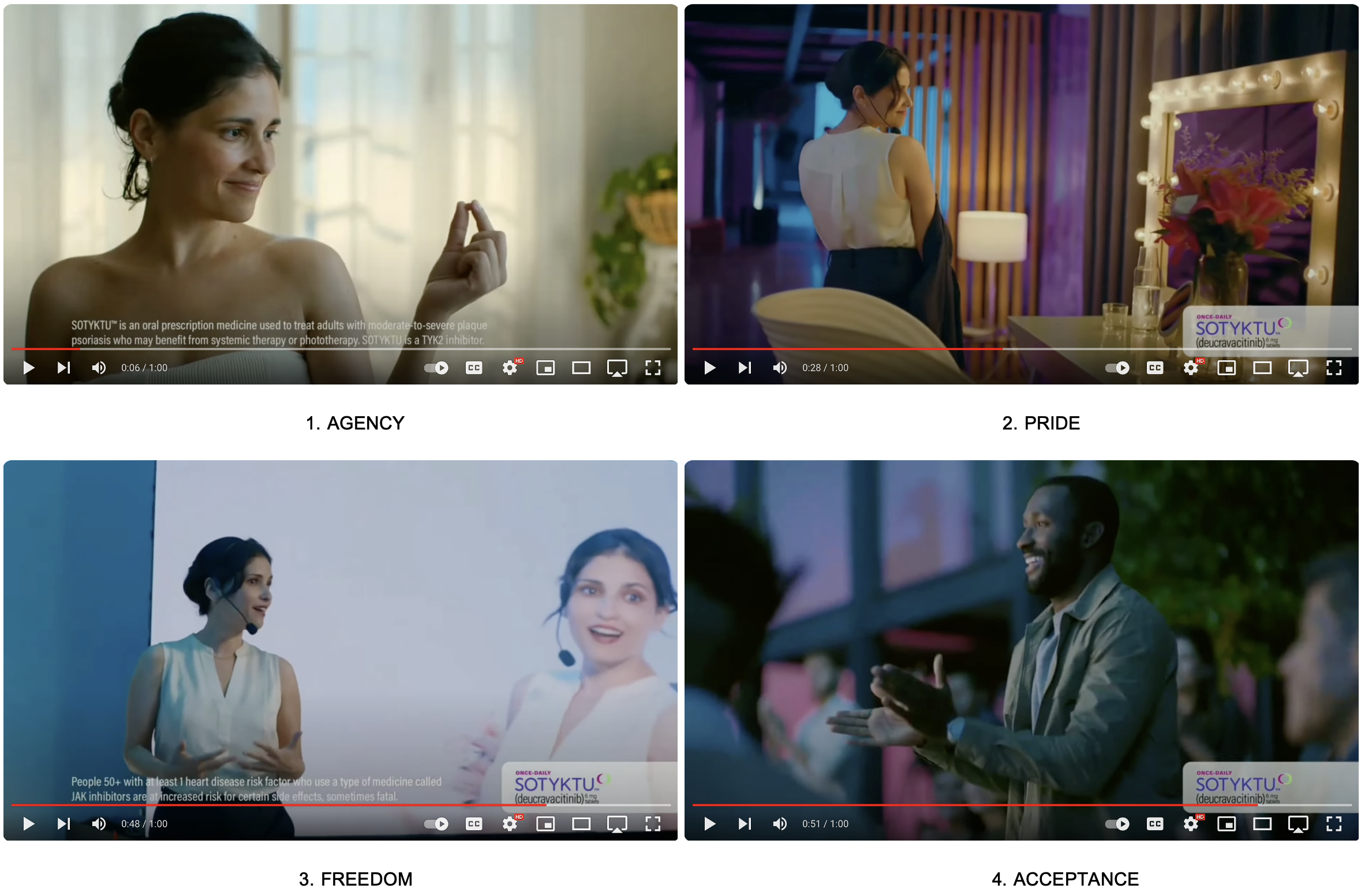
The associated emotions evoked by those messages are agency, pride, freedom, and acceptance. Who wouldn’t want to experience all of those every day! And of course the implicit message is that the pride, freedom, and acceptance are all a direct consequence of agency, of taking the medicine.
A commercial titled “She Found It,” for Sotyktu, a plaque psoriasis medicine, is a good example. The four screen grabs below include the time bar to indicate that the grabs were taken in sequence, showing how the emotions portrayed (and presumably felt sympathetically by viewers) follow one upon the other. [3]
More broadly, physicians and other health professionals use a similar form of layered information provision as a means of managing their patients’ emotional responses to what would otherwise be profoundly disturbing or overwhelming information. See, for example, the SPIKES protocol (Setting, Perception, Invitation, Knowledge, Emotion, and Strategy and summary), among others. [4]
NGOs and community-based health providers employ similar techniques, but instead do so over timeframes of months or years as a critical component of building and maintaining trust. [5]
Nancy Duarte, a communications expert and CEO of Duarte, Inc., offers a twist on this approach. Instead of adding message upon message, Duarte suggests just two messages; What Is, and What Could Be. As a speech or presentation progresses, Duarte counsels toggling between them and making the gap between those two states wider and wider, and in so doing, making the emotions evoked stronger and stronger. That is, making your audience more dissatisfied with What Is and more fervently desirous of What Could Be. You can see elements of Duarte’s approach in announcing major, new healthcare initiatives, but perhaps nowhere more so than in President Obama’s address to Congress on the Affordable Care Act. [6]
Conclusion
This scaffolding technique of communication –building and layering message upon message with the intent of evoking a progression of emotional responses– is highly effective and examples of this can be found everywhere, including, of course, relating to matters of health.
This technique is simple and it is effective.
Please leave your comments below.
NOTES
[1]
The painting is replete with symbols and surprises. The beams are actually part of a dodecahedron, a twelve-sided, sphere-like polyhedron, composed of 12 pentagons, perhaps alluding to the twelve apostles below. The dodecahedron has also been used to symbolize the universe. The floating figure above appears to have two thumbs on each hand. The figure of Jesus was modelled on Dali’s wife, Gala. The coastline is recognizably that of Dali’s home in Portlligat. The apostles on one side of the table appear to be almost mirror images of those on the other side. And, though it may be difficult to discern, there is a dove on Christ’s left shoulder, possibly completing the painting’s representation of the trinity. And no doubt, much more. You can read a description of the painting here:
https://www.nga.gov/collection/art-object-page.46590.html
[2]
Is this what Dali actually intended viewers to experience? Hard to say, but I know that I and others did experience the painting this way so I think it’s a valid example of the layering technique.
[3]
You can see the entire commercial, which contains two, interwoven stories, here:
https://www.youtube.com/watch?v=m5nn3OaiWGU
[4]
“Delivering Bad or Life-Altering News,” Franklin J. Berkey, Joseph P. Wiedemer, Nicki D. Vithalani, American Family Physician, 2018,98(2):99-104.
https://www.aafp.org/pubs/afp/issues/2018/0715/p99.html#:~:text=There%20are%20several%20algorithms%20available,for%20the%20patient%20and%20family.
[5]
Scroll down to the section Key Attributes of a Successful Health Awareness Campaign on this page: https://wearecsg.com/blog/importance-of-health-awareness-campaigns/
And more on trust here: https://www.healthandcommunications.com/articles/trust
[6]
See Duarte’s TED Talk here: https://www.youtube.com/watch?v=1nYFpuc2Umk and her company here: https://www.duarte.com. See President Obama’s address here: https://www.youtube.com/watch?v=SSJugLUsM58


