How Good are COVID Test Instructions?
During the week of May 27, 2023 the U. S. recorded 653 deaths and 7,710 new hospitalizations due to COVID. [1] The disease is still here and many of us continue to test, either out of caution before seeing friends and relatives with weakened immunity or when we ourselves believe we may have been exposed.
So, from a communications standpoint, how good are the instructions provided with those tests? Based on a look at five randomly-selected tests, their instruction sets vary considerably in quality and clarity.
Which Tests?
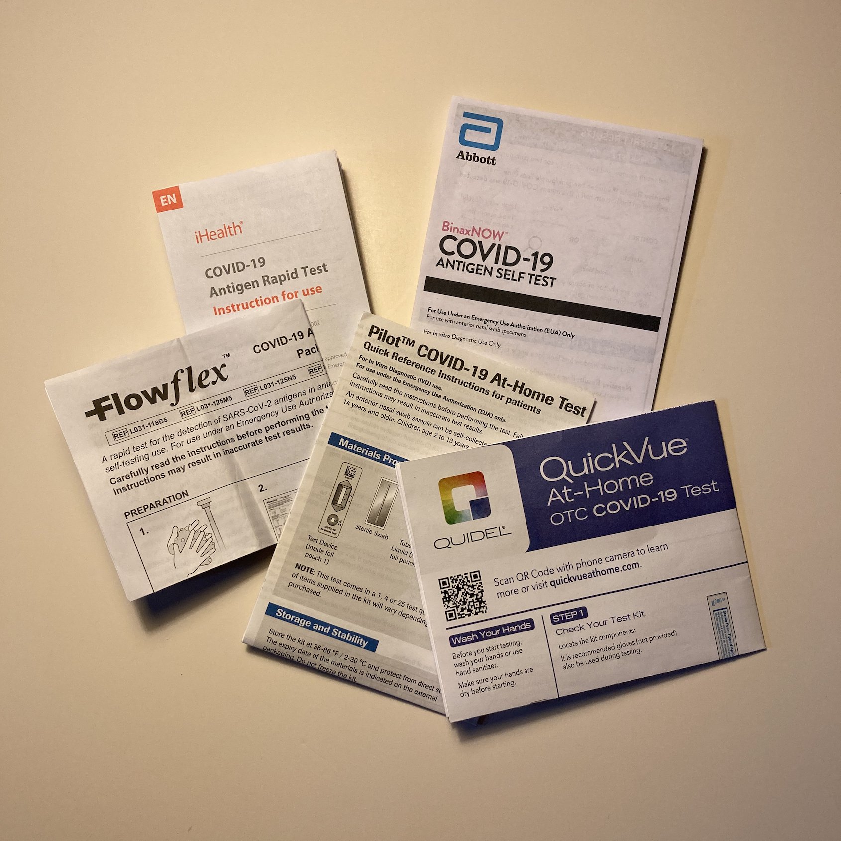
By my count, the U. S. Food & Drug Administration issued Emergency Use Authorizations (EUAs) for 38 at-home COVID antigen tests, 34 of which are currently authorized. [ 2 ] Of those, I chose to look at five that are widely available: BinaxNOW, iHealth, Pilot, QuickVue, and Flowflex (see Figure 1). (You can see the instructions for these tests online using the links in footnote [ 3 ] at the end of this article.) I can’t say how representative these tests are or how they compare with the other 29, so what follows are just observations about these five tests, not conclusions about the full range of at-home COVID tests.
Figure 1: The five tests reviewed.
To Be Fair
Each of the Authorization letters for these tests contained the following (see Figure 2), suspending FDA’s normal requirements for packaging, labeling, etc. Is it fair then to judge these products’ packaging and instructions from a design and communications viewpoint? I think so, because suspending these requirements doesn’t mean the tests’ manufacturers/distributors should be any less diligent in producing clear and easily understood instructions, particularly at a time when there was a great deal of anxiety and confusion surrounding testing specifically and COVID generally.
Figure 2: Except from an FDA Emergency Use Authorization letter. Highlighting mine.
Drawings and Photographs
For the most part the instruction sheets use illustrations instead of photographs most likely because these can convey information that photographs simply can not. See, for example, the following drawing from the QuickVue instructions (Figure 3). Not only does this drawing show how far the swab should be inserted into the nose but also the circular motion required to collect the sample and the number of prescribed rotations, something a photograph could not demonstrate.
Figure 3: A portion of the QuickVue instructions.
The exception to this is that the iHealth and BinaxNOW instructions contain small, somewhat blurry photographs of test results, perhaps an indication that those results can be difficult to interpret. (See Figure 4 showing the iHealth photograph.)
Image Sufficiency
Are the images alone –without any of the text– sufficient to explain the test administration and results interpretation to someone who does not know how to read? For taking the test, it’s a close call but the answer is ‘probably, yes’ provided the test taker could read numbers and understood that “5x” means five times, “3-4x” means three-to-four times, etc.
On the other hand, someone who could not read would not be able to interpret the results just from the illustrations alone. This is not necessarily a shortcoming of the illustrations, but stems from the nature of the tests themselves.
Like many home pregnancy tests, these five are lateral flow tests, which means that immunoglobulins have been placed on the test strips in such a way that as the sample is absorbed across the strip, it will cause one or two lines to appear, a C-line for Control and a T-line for Test. (A C-line alone is a negative result, a C- and a T-line together is a positive result, and a T-line alone is an invalid test.) For the iHealth, Pilot, BinaxNOW, and Flowflex tests, C and T (or Control and Test) are marked on the test kit, but for the QuickVue tests there are no such markings. But again, without being able to read the accompanying explanatory text, these lines and these markings would have no meaning.
To illustrate how difficult it would be to interpret test results without being able to read, see Figure 4 below, showing the results section of the iHealth test and imagine that all the words were blurred out.
Figure 4: Results section of the iHealth test.
The reason this is so important is because only 79% of U. S. adults are considered literate in English. That means some 43 million U. S. adults would have been unable to read any of the English test instructions, and some significant portion of those would not have been able to understand Spanish instructions either. [ 4 ] And it’s worth noting that the iHealth test was the one predominantly mailed out for free during the pandemic and yet, of the five tests reviewed here, it was the only one that did not include a Spanish language instruction sheet in the package.
Positive / Negative ?
As mentioned above, these tests use the same chemical mechanism of some pregnancy tests. One of these, Clearblue Plus, actually shows a plus sign (+) for pregnant and a minus sign (-) for not pregnant instead of the vertical C and T lines of these five COVID tests. (See Figure 5). Would a positive/negative symbol be a more informative way for COVID tests to display their results and make the instructions more understandable, especially for low-or-no literacy persons? Unfortunately, no, due to the inverted logic of the tests. Remember a positive COVID test is a negative outcome (no one wants COVID) and a negative test is actually a hoped-for outcome. Confusion would certainly ensue.
Figure 5: Clearblue Plus pregnancy test.
Design Consistency
For each product, do the instructions and the outside packaging share the same colors and fonts? This may seem almost trivial compared to the other factors or, more importantly, to the test’s accuracy. But design consistency gives the user a subtle, probably subconscious, cue that the product was created in an integrated manner; that the people who designed the packaging spoke to and coordinated with the people who designed, and possibly wrote, the instructions. Again, this says nothing about the test’s accuracy, but it does hint at how professional the manufacturer was, especially given that the tests’ production were greatly accelerated, under the emergency use authorization, compared to typical product releases.
How did they do? Four of the five tests matched package-to-instruction colors; the Flowflex instructions were the only one to be printed in just black and white. All but the Pilot test matched package-to-instructions fonts as well.
For some reason, the Pilot test used slightly different fonts, even, surprisingly, on its logo-name. As you can see below in Figure 6, among other things, notice that the dot (the “tittle”) above the “i” is round on the Pilot box (left) and square in the Pilot instructions (right), the box “l” has a rounded foot where the instructions “l” is perfectly straight, not to mention the obvious size difference in the trademarks. The fact that this occurred with the product’s logo is a concern for brand consistency, but that’s another story.
Figure 6: Pilot test logo from the box (left) and the instructions (right).
Ambiguity
The iHealth insert actually contains instructions for two different tests; each using different test kit components, called “Test Set 1” and “Test Set 2” (see Figure 7 below). Though it’s not difficult to empty the iHealth box, lay out the components, and determine which test set you have, it would seem a better idea to include Test Set 1 instructions with boxes containing Test Set 1 components and Test Set 2 instructions with Test Set 2 components. That does not seem at all unreasonable, given the heightened anxiety of test takers and the need to make the test-taking experience as easy as possible.
Figure 7: iHealth instructions for two different tests.
Use of Color
Three of the five instruction sets use color effectively to emphasize important information, variously tagged “WARNING!,” “STOP,” and “Note.” In addition, four of the sets use color combined with a drawing to illustrate an incorrect procedure; i.e., touching the sample collection end of the swab. In contrast, notice how poor the Flowflex illustration is in Figure 8, given that the ‘prohibited’ line (running from lower left to upper right) is the same color and same weight or thickness as the illustration itself.
Figure 8: How the instructions show users to avoid touching the swab end.
From left to right, better to worse: QuickVue, BinaxNOW, iHealth, Pilot, Flowflex.
URLs for Additional Information
It’s easy to imagine that those self-administering the tests might want information beyond what’s contained in the instructions. Do the instructions provide URLs linking to that information? The Flowflex and BinaxNOW instructions have test-specific links (i.e., www.flowflexcovid.com and www.binaxnow-selftest.abbott) while iHealth and QuickVue have corporate site links with the test prominently featured on their home pages (i.e., www.ihealthlabs.com and www.quidel.com). In contrast, the Pilot instructions link to a corporate site (www.diagnostics.roche.com) with no obvious link to the Pilot test on its home page.
Conclusions
The instructions for the BinaxNOW and QuickVue tests had no obvious shortcomings.
The Flowflex instructions could have benefitted from the use of color and better illustrations.
The Pilot instructions needed a URL to test-specific information rather than to Roche Diagnostics’s corporate site and consistent branding would have heightened user confidence.
The iHealth test package did not include instructions in Spanish and did, perhaps confusingly, include instructions for two different tests. Given that the iHealth test was the one provided free by the U. S. government, and mailed and distributed to millions of Americans, these problems should have been avoided.
Notes
[ 1 ]
https://covid.cdc.gov/covid-data-tracker/#trends_weeklyhospitaladmissions_select_00
[ 2 ]
The 38 count does not include variations on the same test. See: https://www.fda.gov/medical-devices/coronavirus-disease-2019-covid-19-emergency-use-authorizations-medical-devices/in-vitro-diagnostics-euas-antigen-diagnostic-tests-sars-cov-2
34 tests, not including variations, are now authorized. See: https://www.fda.gov/medical-devices/coronavirus-covid-19-and-medical-devices/home-otc-covid-19-diagnostic-tests#list
[ 3 ]
BinaxNOW https://www.fda.gov/media/147255/download
iHealth https://www.fda.gov/media/153924/download
Pilot https://www.fda.gov/media/155126/download
QuickVue https://www.fda.gov/media/147250/download
Flowflex https://www.fda.gov/media/163948/download
[ 4 ]


